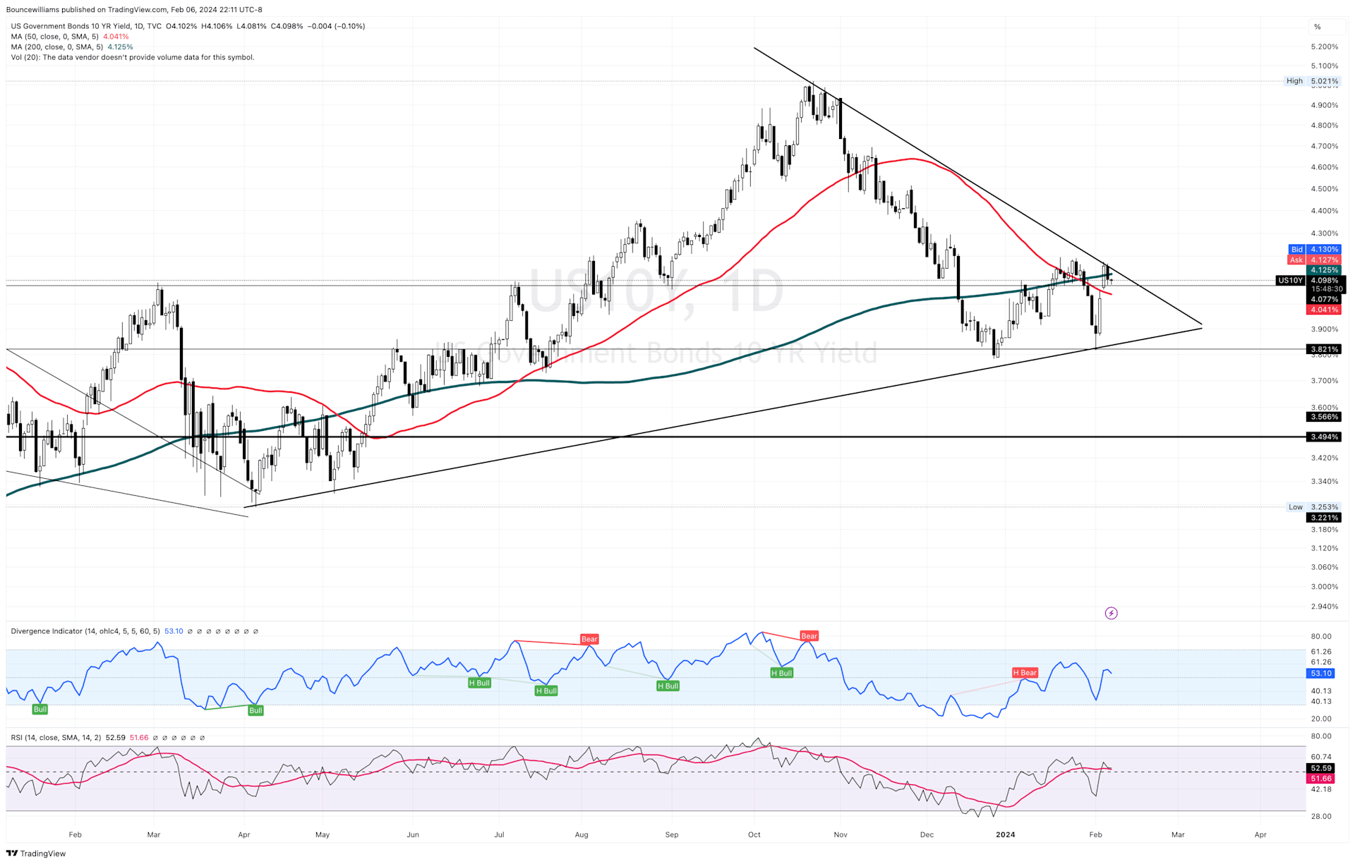
You might be wondering what exactly you're seeing here and how it relates to real estate. Well, what you're looking at is the U.S. Government's 10-year Bond yield, which serves as a key indicator for mortgage rates.
Here are the main points to take away about bond prices and yield, without delving too deeply into the details:
•Treasury securities are essentially loans to the federal government, with maturities ranging from weeks to 30 years. They're generally considered safer investments compared to stocks because they're backed by the U.S. government.
•Bond prices and yields move in opposite directions: falling prices push yields up, and rising prices bring yields down.
•The 10-year yield is closely watched as a proxy for mortgage rates and reflects investor sentiment about the economy. A rising yield suggests decreased demand for Treasury bonds, indicating investors favor higher-risk, higher-reward investments, while a falling yield suggests the opposite.
Now, for those who know me well, you're aware of my interest in the stock market. While studying charts, which I frequently use for stock investing and gauging the real estate market's mood, I came across this insight that I wanted to share with you. Please excuse any confusion, as this is a limited view and focuses strictly on technical analysis (the study of price movement) rather than fundamental analysis.
The chart you're seeing displays the daily price movement of the 10-year treasury yield over the past year. It highlights the 50-day moving average (50-DMA) in red and the 200-day moving average in green (200-DMA). In stock trading, a bullish pattern known as the golden cross occurs when the 50-DMA crosses above the 200-DMA. However, what we're observing here is the opposite - the 50-DMA crossing below the 200-DMA, known as the Death Cross. Additionally, prices have consistently closed below the 200-DMA for the majority of the past two months. The pennant/wedge formation surrounding the prices indicates trend lines serving as resistance and support. Currently, prices are hovering just below the 200-DMA and the downward-sloping trend line which is bearish. However, it’s too early to predict price movements definitively, since there is some positive momentum with prices holding above the shorter-term 50-DMA, and the weekly chart is showing more positive signs. Also, we are at a pivotal point where prices could break above both the 200-DMA and the boundary line of the Pennant/Wedge formation which would be bullish for higher yields if prices can hold above those key levels. However, If prices retreat and break below the lower trend line, there's potential for yields to retreat to around 3.49%, which could be favorable for mortgage rates and, subsequently, the mood of the real estate market.
Another important factor to consider is how the 10-year yield reflects investors' appetite for risk. With the remarkable gains seen in the stock market over the past six months, investors might begin to prioritize risk reduction in the short term. As a result, they may turn to bonds for added protection, which could drive up bond prices and push yields down. Additionally, this analysis doesn't even take into account the potential for the Federal Reserve to cut interest rates. Overall, this trend could support the notion of yields decreasing, which would ultimately be beneficial for mortgage rates. I'm keeping a close eye on the charts to determine which direction the 10-year yield will take.
I'm eager to hear your thoughts on whether this analysis was useful or if it left you feeling confused.
Disclaimer: The views expressed in this chart are solely my opinion and should not be considered as financial advice. Always conduct your own research before making investment decisions.


